
Pondering the Paradoxes of Ecommerce SEO

Summary: In this article, you’ll learn:
— 4 common issues that ecommerce sites face when optimizing for Google.
— How to leverage category pages for SEO.
— How to integrate community into your ecommerce site.
— A unique duplicate content fix for similar products.
If you’ve been keeping up with the latest SEO news, you know that Google frequently rolls out updates that seem unfavorable, even unfair to ecommerce sites.
Google continuously makes adjustments that increase ranking for sites with high social signals, Google + 1s, Facebook likes, Twitter followers, and social bookmarks. They reward original content, and seem to penalize everything else. The reaction from the ecommerce world has been “jeez…can we get a break here?” Most shoppers don’t want to “like” us on Facebook, they just want to get their order shipped and move on with their day. And how much interesting content can you really write about, say…a cheese grater?
It turns out that the answer to that last question is qQuite a bit.” Ecommerce SEO is riddled with paradoxes like these; issues that don’t seem to have an easy fix.
Today we examine some of the most pressing problems and paradoxes that an ecommerce site may face with ranking, and show you an example of an ecommerce site that has been able to dominate Google, despite selling relatively uninteresting products.
Paradox #1: In order to get placement in the search engines, you need a certain amount of backlinks and social signals. Yet the most profitable pages (i.e. the product pages) are not always interesting enough to generate them.
SEO is heavily contingent on getting a requisite amount of links to your site, as well as getting some social activity. Things like tweets, retweets, shares, likes, and social bookmarks go a long way in Google’s eyes.
But the pages you really want to rank, your product pages, probably aren’t that exciting. In fact, if you’re anything like most ecommerce sites, there would be little reason for someone to link to it, share it with their friends or blast it out on Twitter.
The solution? If your product page lacks affinity to social media, consider building links for the category pages instead.
Category pages are easier to spice up than individual product pages. For example, if you have a site about gardenware, your product pages may include items like:
- Garden sloggers, Rubber
- Garden sloggers, Plastic
- Garden sloggers slip-on, Rubber
- Garden sloggers slip-on, Plastic
It’s hard to imagine an amazing, link-friendly product page for “Garden sloggers slip-on, Plastic” but it’s a lot easier to imagine an awesome category page about gardening while wearing sloggers.
A category page filled with interesting stories, user-created content, and gardening success stories can be real link bait and since the category page has a direct link to each product page, you’ll pass some of that link juice down to each product. Would it have been better to get a link directly to that product page? Sure. But a category page with a strong link structure is the next best thing.
Paradox #2: Community-building is one of the most powerful SEO tactics but how to build a community around products that are not interesting? Who wants to buy a cheese grater and be part of an online cheese grater community, for example?
Google has clearly started favoring sites with communities. A community, in this context, means a website that allows users to log in, create content for the site, and comment on the content others have created. For it to be effective you must have a significant amount of individuals regularly logging in, posting and commenting.
Developing a community around your ecommerce site may not always be easy but it’s critical from an SEO standpoint. Odds are you will be the only site in that vertical with a strong community and the SEO benefits of that cannot be overstated. So how do you build a strong community despite an uninteresting inventory?
Design and uniqueness: Community starts with design. Having a unique design to your site is the only way to ensure people are convinced this is something special and different. That is where you start.
Below is a nice invitation to join the community of www.woot.com, an ecommerce site that sells pretty boring stuff but has a vast collection of people interacting on it.
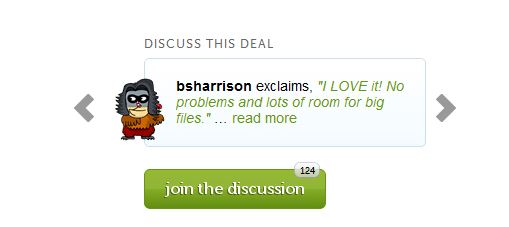
You can see the invitation has a live feed from people commenting about the product, and doubles as a review system.
Make the entire process seamless: Ease of use is vital when creating community. On an ecommerce site, people generally join to discuss specific products and share their insights or expertise.
Place the “join the discussion” or “join the community” button right next to the product, and make it large and appealing. Signing up should be a cinch, with a Universal Connect system like www.disqus.com allowing people to sign in via Facebook, Twitter, Google, etc.
And if users sign up with a social media profile, don’t make them verify via email. Only normal registrants should have to do that. After sign up, automatically redirect users to the product page they were intending to discuss…don’t make them look for it again!
If someone replies to a user’s post, automatically send updates to their email inbox (although you should make it easy to unsubscribe via a link in the email).
Allow people to talk about stuff other than the product: For example, if you sell kitchen appliances, have a thread that says “everything except kitchen appliances.” That way people can just have fun on the site as well.
Provide social learning: Creating a social learning avatar is an important step in convincing people to use the community. We MUST be taught how to use your community. Consider a link in the navigation bar that says “New to the site? Start here.” Upon clicking that link, users will encounter a virtual avatar, perhaps it can even be a cartoonized version of you. This need be no more than a single image with text. There you will explain the process of joining the community and the benefits. After you have monitored user behavior over a few months, determine if there are site features that are confusing or under-utilized. Consider making the avatar appear at those points to explain the process to users.

Fatty: A social learning avatar on a popular cell phone accessories site
Gamify the community: Gamification is the process of applying game mechanics and techniques to something other than a game. Why gamify the site and community? Because games are fun! And if your website is fun, it will increase time-on-site, links, social signals, inter-page browse rate, and user-generated content; all Google ranking impact factors. To gamify, you will need to take the following steps:
— Give points to frequent contributors and let them cash out for products. This can double as virtual currency that people can trade and give to other members of the site.
Virtual currency can be given for reviews, answering questions, emailing a friend a coupon (members should be able to download coupons at any time), uploading content about themselves, signing up new members, buying products or posting links about the site.
— Create social avatars. A social avatar is a member’s character they use on the site. Similar to the social learning avatar mentioned above. Every time they post, the character appears next to their post. The avatar can be a photo of themselves, or a custom character design they developed in the account registration portion of the community.
— Create social comparisons: Next to the avatar, show the member’s points, how long they have been on the site, and what they have bought. The more social comparisons you create, the more interesting the site becomes. Also, seeing how far along others are will encourage the kind of behavior you want from your community members. It is normalizing. For example, if you see a senior member has bought 30 items from the site, it increases the feeling of safety you will have about purchasing and recommending the site to others.
— Develop a user search engine. Users will want to talk to people who have bought similar items and are interested in similar things. Make it easy for users to find and connect with each other.
— Encourage self expression and customization: Let people really customize their personal pages, avatars, and accounts. The more customized they can get, the more they will have a personal relationship with the community and get involved.
— Moderate frequently and transparently: Moderators should have their own accounts and avatars on the site. Consider making the authority of the mods humorous. An ecommerce community I like, which sells cheese, has “cheese cops,” for example. If the mods take action, like deleting the post of a real person, they should always publicly explain why they did it. Keep in mind your community may easily be abused by spam bots and people looking just to link drop their product.
— Make it mobile: People’s boredom threshold changes on mobile devices. We are often willing to try new things when waiting for food or riding the subway. Make sure your site and community functions on iOS and Android OS.
Paradox #3: In order to provide shoppers the best experience, you often have to provide the product in multiple colors and/or sizes. This means creating duplicate content (a page for the green purse and a page for the red purse, for example) but Google HATES duplicate content. Simply telling Google not to crawl the red purse page will limit the product’s exposure on Google. What to do?
This is an issue I see people running into a lot. Usually the WORST fix for this is to build a separate product page for each sub-type of product. For example, if you sell brown single-strap sandals and black single-strap sandals, don’t build separate pages for both. This will create a lot of duplicate content which you will have to disallow.
Instead, create one general page for sandals. Then create a drop down menu next to the image which will allow customers to customize. With instant feedback, the customer can add or remove number of straps, change size, and change color. It’s more fun and will ensure the user stays on the page longer, which is a ranking impact factor for Google. Having the traffic concentrated on just a single page will improve its position in the search engines as well.
Exception: There is an exception to this rule. If you have determined that the product sub-type is a keyword with significant traffic, you will need a separate product page for it. For example, based on your keyword research, you may determine that “black double-strap sandals” is a keyword with significant enough search volume to warrant a unique page. In that case, don’t add it into the feature changing system mentioned above but create a unique page with unique content.
Paradox #4: Having a transparent review system is vital for SEO but a negative review could hurt sales.
Getting a bad review is never a pleasant thing. If the review is truly scathing or feels unfair, naturally the webmaster has the urge to take it down. After all, who cares if a single customer is swept under the rug if keeping the review could hurt sales?
But from an SEO standpoint, censorship of your site is a bad idea. People have to believe in your brand. For social media, community building and SEO to work, you have to have brand believers; People who will post your links, share your content and interact on your site because it is a safe, and real place to hang out and do business. Removing bad reviews will delegitimize it.
And now…the perfect product page!
To wrap things up let’s look at what I think is the perfect product page from an SEO standpoint. What www.woot.com is selling here is no more interesting than your average product, just a simple USB. But it is executed flawlessly. Take a look at the page and then review my comments next to each corresponding number.
(click to magnify)
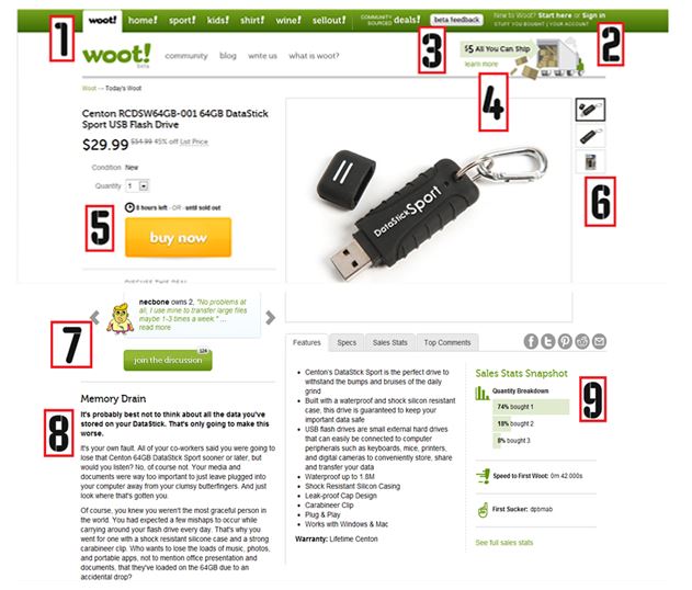
1) Awesome nav bar. Though you can’t tell from that slide, this is the reason the nav bar is awesome.
When you click on it, it doesn’t just give you a list of items, it creates a drop-down “mini page” where you can initiate the check-out process.
2) Social learning and community: As mentioned above, joining and understanding the community can be done easily from here.
3) Brilliant comment/review ploy: Don’t let them fool you, Woot has not been in Beta mode for a long time. They are cleverly getting you to commit to their site by asking for feedback and acquiring your contact info. They may make some of the changes you suggest or they may not but they have now gotten your contact info and they will use it.
4) Sales incentive: This is a great spot for your sales incentive. Woot is using free shipping if the shipping cost is over $5.
5) Call to action: Nice call to action here with a big, beautiful button you cannot miss. Also, there is an artificial constraint on time: 8 hours left to get the deal or until “sold out” (obviously “selling out” is artificially induced to drive more sales as they could always purchase more USBs from the manufacturer).
6) Changing specifications: As mentioned here, users can easily change the product type from this sidebar. If you have the product in different colors or sizes, this is the place to put those options without creating a unique page for each product variation.
7) Community: This is a great place to see the community in action. Each community member can custom design an avatar and join in the conversation.
8) Amazing, unique sales copy: It’s not easy to come up with this much text about a memory stick, but they did it. This sales copy is entertaining and reads well, keeping users on site and helping with SEO.
9) Sales stats: A powerful trust signal. People want to know how others behaved. The “first sucker” part is especially brilliant, as users may be incentivized to buy just to have their name here.